09/04/2023 Bikepacking Spain Day 27 : Riders Block
Photos:

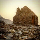
Briefly back on the Camino de Santiago... at least one version of it.
--

Today was just a fun day where nothing exciting happened and there weren't any major difficulties. The "human condition" is a strange thing. On one hand, you want everything to always go perfectly because that is easier... but on the other hand, those challenges, freaky people, and surprises are the precise reason we engage in bikepacking trips - seeking adventure.


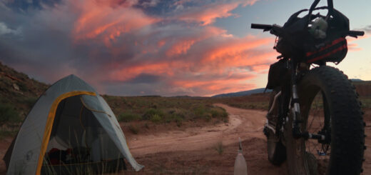
Sun or moon? It's the sun! Today had some strange and dense clouds. I pointed the camera (with polarizing filter) at the sun and dialed back the exposure a fair bit. Another storm predicted for tonight. The weather has been crazy and fast changing here every day.
--


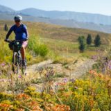
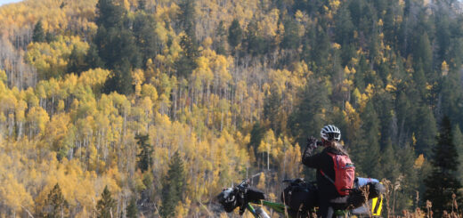
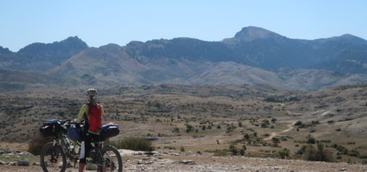
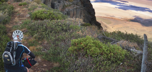
Single track fun today. Mostly rideable by Janet too!
--

I called today's ride "Riders Block" because with the new Strava app, it is harder to write captions (and harder to read them too). Sigh. I hope they change it back so I can continue to be motivated to story-tell. What does your strava app look like: the one on the left or the right?
--
Strava Comments:
Janet W.
It feels great to have a single track + rail trail day + good groceries, clean clothes + abed to sleep in. Thanks for making me look good in the trail photos!
Osman I.
The Strava app in my Android phone displays the picture like the one on the right. So, I wouldn't have noticed the change. But Judy's iPhone shows it like the picture on the left.
Corrine L.
My Strava has changed too. Don’t like it as well.
Ann L.
I like the action pic of Janet rocking the trails!
Rush T.
Android, Strava app looks like the one on the Left. I am not aware of anything being different. And when I say, Left, that means, Port side. 🙂
Gordon L.
Mine looks like the left one.
Deb J.
Changed several days ago to look like the left side. Don’t like it as much either! It’s still pretty easy to read, so please don’t stop!! 😘
Gary M.
I also prefer the old style on the right…much easier to read. 🤔
Judy I.
Love the old white-framed photos with clear captions, don’t like the new version. I enjoy the narratives of my favorite posters as much as their photos, and I like the human power and GPS framework of this social media site so I don’t want to switch to Insta or another photo-friendly app. How can I get the old Strava back?
Judy I.
Oh and love your photos as usual Brian! My favs today are you crouching on the hillside by the waterfall flying Droney, and Janet on the singletrack.
Osman I.
The problem of the image covering the caption may be not specific to the app version or the operating system, but to the size (or aspect ratio) of the display. On my phone, Strava photos look like the example on the right, but I just discovered that when I zoom in, they look like the one on the left. My phone is rather tall and narrow.
Vicki C.
Mine also looks like the one on the left and i prefer the one on the right. It’s irritating when someone “improves” something and makes it harder to use and enjoy
Santosh M.
The ui is designed unfortunately for small photo captions, you can send feedback to Strava
Mark G.
Mine is like the one on the right. But, if I'm on my laptop it is like the one on the left. I am Happy yo had a "boring" beautiful, relaxing day. Nice waterfall hunt photo
Brian L.
Thanks guys for telling how your Strava looks. Vicki Carroll - YES! This seems to happen so often, this idea of “improving” things - that aren’t improvements. 😑
Tom M.
The left. Just changed recently. Looks cool but harder to finger scroll on the longer entries.
Ride Stats:
| Elapsed Time | Moving Time | Distance | Average Speed | Max Speed | Elevation Gain | Calories Burned |
|---|---|---|---|---|---|---|
|
05:38:03
hours
|
03:48:07
hours
|
52.83
km
|
13.90
km/h
|
48.94
km/h
|
435.10
meters
|
1,513
kcal
|


